J.P. Morgan Chase
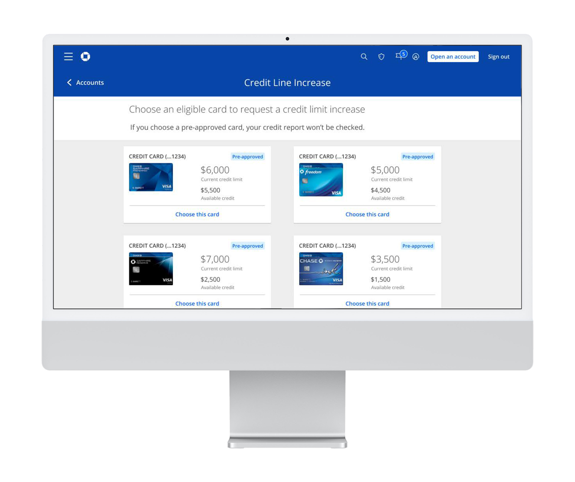
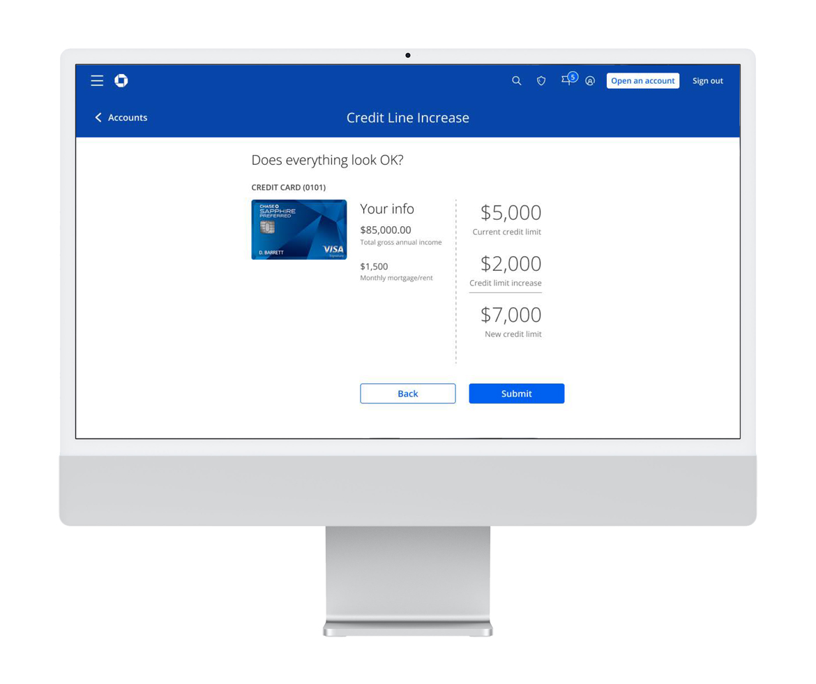
Overview: Requirements for this project tasked me with creating a new feature to allow Chase card customers to increase their credit line by updating their personal information such as, for example, salary and/or mortgage. The system would be able to detect if the user currently had accounts that were eligible for this increase method.
Role: UX/UI designer, UX researcher,
Tools: Figma, Adobe CC
Research
Competitive Research
The main focus was evaluating the how competitors gather information from their users. I looked at how they prompted and incentivized users and the methods they employed to explain their request.
-
Identify Competitors: The first step was to create a list of direct and indirect competitors in the banking and finance industry.
-
User Interface Analysis: By examining the layout, navigation, and design elements of competitors’ websites and mobile apps, we identified both effective and ineffective practices that could impact the user experience.
-
Information Capture Process: Capturing user info is a common practice across many applications, many of them not involved with finance. I researched many of these UI layouts and pulled ideas from components and elements I thought might be useful.
-
Mobile App Functionality: Per the original request, the app was to be designed in not only web, both hybrid and native mobile environments. How the competitors’ apps behaved during interaction was
Analysis & Planning
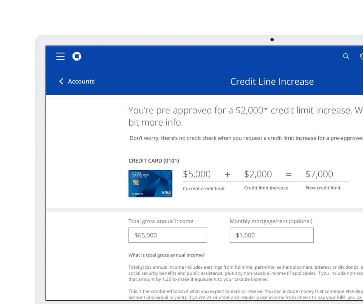
Working side by side with product owners and managers, the direction and goals were established and agreed upon. There would be multiple versions of this new feature that would be launched based on the personas accessing the product. The offer was prompted to Chase customers with qualifying card accounts. The goal was to gather information for future offers and rewards based on their updated information.
Design
During wireframing stage, I used the Manhattan Design System, which allowed for quicker high resolution designs and user testing. One of the needs for the design was to show the users what the reward would be if they were to provide the updated information.
Prototypes & User Research
Once I shared the wireframes with stakeholders and team members for feedback, I created clickable prototype to conduct usability testing group of users for insight gathering. We went through several rounds of user-testing with a research partner and the team. This project went through at least four groups of users. These meetings would last a good portion of the workday and were comprised of 6-7 Chase customers.
Launch & Development
Before moving to development, I met with accessibility partners to identify potential barriers and areas for improvement that I might have overlooked. During this project I regularly collaborated with my accessibility partner to ensures the product stayed up-to-date with the latest accessibility practices and standards and avoid too much back-tracking.
Once the designs were completely done, it was time to hand over assets along with specs to the developers. Being a front-end developer, I was able to communicate the details and needs for a successful implementation. I would conduct multiple desk checks each week with the developer assigned to the product.
| Client: | Anna Doe |
| Date: | April 8, 2024 |