J.P. Morgan Chase
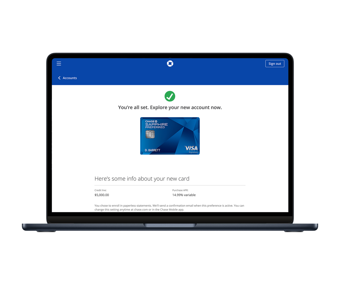
Overview: Chase leadership requested the development of a new product specifically designed for Chase cardholders. The project aimed to provide a user experience that enabled Chase cardholders to seamlessly transfer unused credit and balances from one or multiple existing credit card accounts to a new credit card.
Role: UX/UI designer, UX researcher
Tools: Figma, Adobe CC
Research
Competitive Research
Researching the user experience for credit card accounts involved analyzing how competitors design their services. This included evaluating the ease of application processes, online account management, reward redemption, customer support, and mobile app functionality. By identifying strengths and weaknesses in competitors’ offerings, the findings were applied with the goal to enhance Chase’s own user interface. The aim was to attract customers to this new feature, ensuring a smooth, intuitive, and engaging experience.
-
Identify Competitors: The first step was to create a list of direct and indirect competitors in the credit card market.
-
User Interface Analysis: By analyzing the layout, navigation, and design elements of competitors’ websites and mobile apps, we identified both positive and negative practices that could influence the user experience.
-
Credit Transfer Process: Assessing the simplicity and efficiency of the credit transfer process proved have little effect as there was no competitive example of our concept at the time.
-
Mobile App Functionality: Per the original request, the app was to be designed in not only web, but both hybrid and native mobile environments. How the competitors’ apps behaved during interaction was observed and noted.
Analysis & Planning
Working side by side with product owners and managers, the direction and goals were established and agreed upon. There would be multiple versions of this new feature that would be launched based on the personas accessing the product.
- Persona 1: Credit card user has a decent credit rating and has not over-extended their credit use. However, we want to offer them to chance move unused credit from existing cards instead of creating a card with a new line of credit.
- Persona 2: Credit card user has a low or insufficient credit rating and may not qualify a new card. This new product could provide them the opportunity to obtain a new credit line despite these issues.
- Persona 3: Credit card user has a very high credit rating along with a large amount of unused credit. This new feature would be offered as an option.
Design
During wireframing stage, I created a visual guide that represented the skeletal framework of the credit card app. Using the Manhattan Design System, I was able to create more fleshed out wireframes that would appear closer to the final design which, in turn, helped speed up the design process and quickly get the team to user testing.
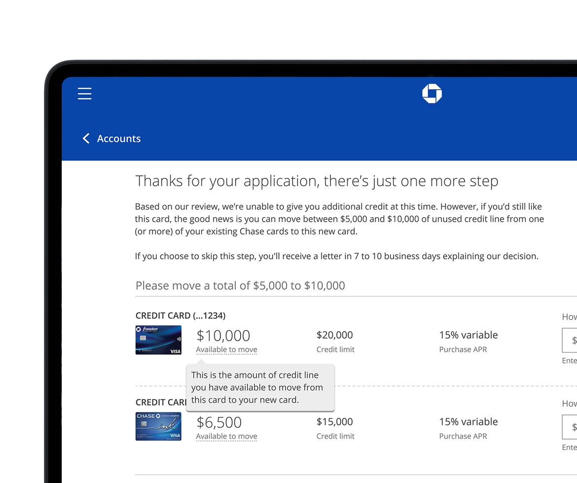
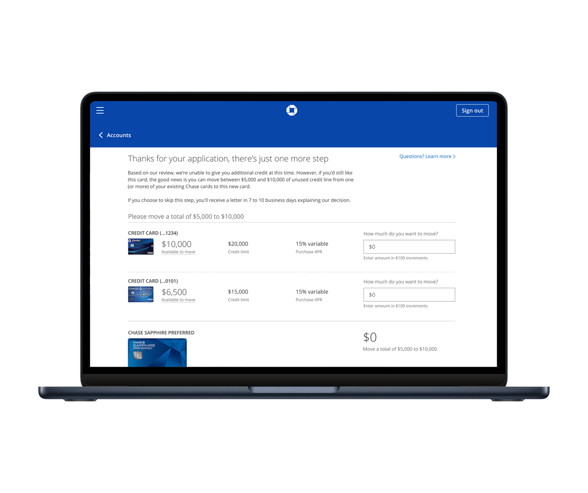
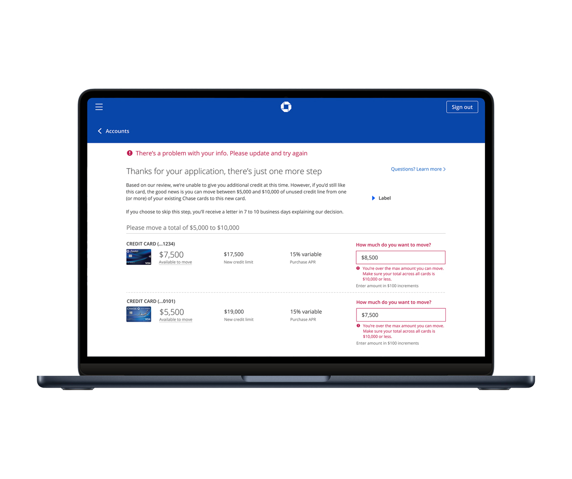
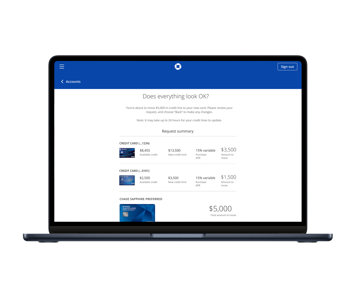
During the design process I looked for opportunities to enhance the UX and provide the users with “surprise and delight”. One of these features was allowing the user to see the dollar amounts they enter into the required field interact in real time. With error messages implemented, this feature allowed the users to see any missteps and be able to correct them immediately before progressing.
Content
The proper messaging was key to providing instructional information to guide the user through the process of transferring unused credit. I worked closely with a content lead to craft the appropriate copy. This process involved not only working with stakeholders, but also legal as some messaging could only be placed in certain areas of the UI or against components.
Prototypes & User Research
Once I shared the wireframes with stakeholders and team members for feedback, I created clickable prototype to conduct usability testing. The project went through several rounds of user-testing with a research partner. This project went through at least five groups of users; these meetings would last the entire day and were comprised of 7-8 Chase customers. Not only was user testing part of this research process, but also usability testing. Working with the internal research partners, we gathered user feedback, synthesized this information, and I produced iterations based on these findings.
Launch & Development
Before moving to development, I met with accessibility partners to identify potential barriers and areas for improvement that I might have overlooked. During most of the time working on these project I regularly collaborated with my accessibility partner to ensures the product stayed up-to-date with the latest accessibility practices and standards and avoid too much back-tracking.
Once the designs were complete, it was time to hand over assets along with specs to the developers. Being a front-end developer, I was able to communicate the details and needs for a successful implementation. I would conduct multiple desk checks each week with the developer assigned to the product
After the launch of this product the result was a 1.7% rise in credit card applications and 1.3% rise in market share.
| Client: | J.P. Morgan Chase |
| Date: | April 10, 2024 |